 English
 عربي
عربي
Get the Latest Updates!
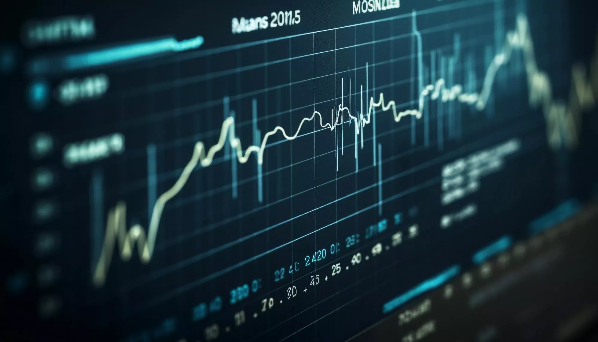
How to Read Forex Charts: Candlesticks, Trends & Key Patterns Explained
Learn how to read forex charts from scratch — candlesticks, chart types, trend identification, support & resistance, and the key patterns every trader must know.
Every trading decision you make — whether to buy, sell, or stay out — should be grounded in what the chart is telling you. Charts are not noise. They are a real-time record of every buy and sell decision made by millions of traders worldwide, compressed into a visual language that, once you learn to read it, gives you a genuine edge in the market. The problem is that most beginners open a chart for the first time and see chaos — dozens of candles, lines, and indicators with no clear meaning. This guide changes that.
By the end of this article, you'll understand the three main chart types, how to read candlestick patterns, how to identify trends and key levels, and how to use this knowledge to time better trade entries — on any instrument, from forex pairs to gold to stocks.
The 3 Types of Forex Charts
Before reading a chart, you need to choose which type to use. Each chart type displays price information differently — and each has specific strengths depending on your trading style.
1. Line Chart
The simplest chart type. It connects closing prices with a single line, giving you a clean view of the overall price direction. Line charts are excellent for identifying the big-picture trend but offer no detail about price action within each period. Best used on Daily or Weekly timeframes for trend identification.
2. Bar Chart (OHLC)
Bar charts display four data points for every period: Open, High, Low, and Close (OHLC). Each bar shows a vertical line representing the high-to-low range, with a left tick for the open and a right tick for the close. More informative than line charts but less visually intuitive than candlesticks.
3. Candlestick Chart
The most popular chart type among professional traders worldwide — and the one you should master first. Candlestick charts display the same OHLC data as bar charts but in a visually rich format that makes price action patterns immediately recognizable. The body of the candle shows the open-to-close range; the wicks show the high and low extremes. Green (or white) candles = price closed higher than it opened. Red (or black) candles = price closed lower than it opened.
| Chart Type | Data Shown | Best For | Recommended Timeframe |
|---|---|---|---|
| Line Chart | Close price only | Big-picture trend | Daily / Weekly |
| Bar Chart (OHLC) | Open, High, Low, Close | Detailed price range | H1 / H4 / Daily |
| Candlestick Chart | Open, High, Low, Close | Price action & patterns | All timeframes |
How to Read a Candlestick
Each candlestick tells the complete story of price action within its timeframe — whether that's 1 minute, 1 hour, or 1 day. Mastering candlestick reading is the single most useful skill for a chart-based trader. Here's what every candle communicates:
- Body: The rectangular area between open and close. A large body = strong directional conviction. A small body = indecision or balance between buyers and sellers.
- Upper Wick (Shadow): The line extending above the body. Shows how high price reached before being pushed back down. Long upper wick = sellers rejecting higher prices.
- Lower Wick (Shadow): The line extending below the body. Shows how low price fell before buyers stepped in. Long lower wick = buyers rejecting lower prices.
- Color: Green/White = bullish candle (closed above open). Red/Black = bearish candle (closed below open).
The relationship between body size, wick length, and color gives you an instant read on market sentiment. A large green candle with no upper wick = strong bullish momentum, no selling pressure at the close. A small red candle with long wicks on both sides = maximum indecision — neither buyers nor sellers in control.
The Most Important Candlestick Patterns
Certain candlestick formations repeat across all markets and timeframes — and they carry predictive value when they appear at key levels. You don't need to memorize 50 patterns. These 6 are the ones that actually matter in live trading.
1. Bullish Engulfing
A small red candle followed by a large green candle whose body completely engulfs the previous candle's body. Signals a strong reversal from bearish to bullish sentiment — especially powerful when it appears at a support level or after a sustained downtrend. One of the highest-reliability reversal signals in forex.
2. Bearish Engulfing
The opposite: a small green candle followed by a large red candle that engulfs it completely. Strong reversal signal from bullish to bearish — most reliable at resistance levels or after a significant uptrend. Look for this pattern to confirm short entries.
3. Hammer
A candle with a small body at the top and a long lower wick — at least 2× the body length. Shows that sellers pushed price sharply lower but buyers overwhelmed them before the close, pushing price back up. A bullish reversal signal when found at the bottom of a downtrend or at support. The longer the lower wick relative to the body, the stronger the signal.
4. Shooting Star
The mirror image of the hammer — small body at the bottom, long upper wick. Price was pushed sharply higher but sellers rejected the highs and pushed it back down. A bearish reversal signal at the top of an uptrend or at resistance. One of the most reliable patterns for timing short entries on gold (XAUUSD) and major pairs.
5. Doji
A candle where the open and close are nearly identical — creating a very thin or nonexistent body with wicks on both sides. The Doji represents maximum indecision: neither bulls nor bears won the period. Alone it's neutral, but when it appears at a key level after a strong trend, it signals a potential reversal or at minimum a pause. Always wait for the next candle to confirm direction.
6. Pin Bar (Rejection Candle)
The pin bar is the most widely traded single-candle pattern. It has a very small body and an extremely long wick on one side — showing sharp price rejection at a specific level. A bullish pin bar at support (long lower wick) is an extremely high-probability entry signal. A bearish pin bar at resistance (long upper wick) signals selling pressure. Pin bars on H4 and Daily timeframes carry the most weight.
Practice Reading Charts on Live Markets — For Free
The fastest way to master chart reading is to practice on a real demo account with live price data. Open a free demo, pull up candlestick charts, and start identifying patterns on your own — with zero financial risk.
Open Free Demo Account →How to Identify a Trend on a Chart
The trend is the single most important piece of information a chart provides. Trading with the trend dramatically improves the probability of any individual trade. There are only three possible market conditions: uptrend, downtrend, and ranging (sideways).
Uptrend: Higher Highs + Higher Lows
An uptrend is defined by a series of higher highs (HH) and higher lows (HL). Each rally pushes to a new peak above the previous one, and each pullback finds support above the previous low. As long as this structure holds, the trend is intact and buy setups have higher probability than sell setups.
Downtrend: Lower Highs + Lower Lows
A downtrend is defined by lower highs (LH) and lower lows (LL). Each rally fails below the previous high, and each selloff breaks below the previous low. Sell setups have higher probability in this environment. Fighting a downtrend by buying is one of the most common and costly beginner mistakes.
Ranging (Sideways) Market
When price oscillates between a consistent ceiling (resistance) and floor (support) without making new highs or lows, the market is ranging. In a range, both trend-following strategies fail frequently — the best approach is to buy near support and sell near resistance, with tight stops just beyond those levels. Ranges eventually break out — and the breakout direction often signals the next major trend.
| Market Condition | Structure | Best Strategy | Avoid |
|---|---|---|---|
| Uptrend | HH + HL | Buy pullbacks to support | Selling against the trend |
| Downtrend | LH + LL | Sell rallies to resistance | Buying against the trend |
| Range | Equal highs + lows | Buy support, sell resistance | Breakout trades inside the range |
Support and Resistance: The Foundation of Chart Reading
Support and resistance levels are the most powerful concept in technical analysis — and they're visible on every chart, across every timeframe and instrument. Understanding them transforms a chart from a confusing collection of candles into a map of market psychology.
What is Support?
A support level is a price zone where buying pressure has historically exceeded selling pressure, causing price to bounce upward. It represents a price where many traders consider the asset "cheap" and step in to buy. The more times price has bounced off a level, the stronger that support becomes. Round numbers (1.0800, 1.1000, $3,000 on gold) are the most commonly respected support zones across all markets.
What is Resistance?
A resistance level is a price zone where selling pressure has historically exceeded buying pressure, causing price to reverse downward. It represents a price where many traders consider the asset "expensive" and sell. Resistance flips to support once price breaks above it — and support flips to resistance once price breaks below it. This flip is one of the most reliable and tradeable phenomena in the market.
How to Draw Support and Resistance Levels
- Start on the Daily chart — major levels are always identified top-down
- Mark price zones where you see at least 2–3 clear bounces or rejections
- Focus on zones, not exact lines — price doesn't respect single pip levels
- Pay special attention to previous swing highs and lows, daily opens, and round numbers
- Drop to H4 or H1 to refine entry timing once you've identified the zone on the Daily
Timeframes: Which One Should You Use?
One of the most common mistakes beginner traders make is using a single timeframe in isolation. Professional traders use a top-down multi-timeframe approach: identify the trend on higher timeframes, then drop to lower timeframes to time the entry with precision.
| Timeframe | Purpose | Trading Style | Check Frequency |
|---|---|---|---|
| Weekly (W1) | Major trend direction | Position trading | Once/week |
| Daily (D1) | Key S&R levels, daily bias | Swing trading | Once/day |
| H4 | Trend confirmation, zones | Swing / Day trading | 2–3×/day |
| H1 | Entry timing, pattern formation | Day trading | Every few hours |
| M15 / M5 | Precise entry & stop placement | Day / Scalping | Active session monitoring |
The golden rule: never trade against the daily trend on a lower timeframe. If D1 shows a clear uptrend, only look for buy setups on H1 and H4 — not sell setups. This alignment alone dramatically improves your win rate. You can also use the live Charts on New2Money to practice reading multiple timeframes in real time.
Key Chart Patterns Every Trader Must Know
Beyond individual candlestick patterns, multi-candle chart patterns provide powerful signals about where price is likely to go next. These are the most reliable ones used by professional traders.
Head and Shoulders
One of the most reliable reversal patterns in all of technical analysis. Forms at the top of an uptrend: a left shoulder (rally), a head (higher rally), and a right shoulder (lower rally). When price breaks below the "neckline" connecting the two shoulder lows, a significant bearish reversal is confirmed. Target = distance from head to neckline, projected downward from the break.
Double Top / Double Bottom
A double top forms when price tests the same resistance level twice and fails both times — signaling seller dominance at that level and a likely reversal downward. A double bottom is the mirror: two tests of support with bounces both times, signaling buyer strength and a likely reversal upward. These are among the cleanest, most actionable patterns for beginner traders.
Triangles (Ascending, Descending, Symmetrical)
Triangles form during consolidation as price makes progressively tighter swings. An ascending triangle (flat top, rising lows) tends to break upward. A descending triangle (flat bottom, falling highs) tends to break downward. A symmetrical triangle can break either way — wait for the breakout candle before committing to a direction. Use the Analysis section to stay updated on active patterns across major markets.
Flags and Pennants
Continuation patterns that form after a sharp, impulsive move (the "flagpole") followed by a brief consolidation. A flag is a rectangular consolidation channel against the trend direction. A pennant is a small symmetrical triangle. Both typically resolve with a continuation of the original move — making them high-probability entries in the direction of the prevailing trend.
Use the Right Tools Alongside Your Chart Analysis
Once you identify a trade setup on the chart, use New2Money's free calculators to size your position correctly, calculate your pip value, and set your stop loss and take profit levels with precision — before every single trade.
Explore All Trading Tools →How to Use Moving Averages on Your Chart
Moving averages (MAs) are the most widely used indicator in forex trading — and for good reason. They smooth out price noise and make the trend visually obvious. The two most important are:
- 20 EMA (Exponential Moving Average): Tracks short-term momentum. When price is consistently above the 20 EMA, short-term trend is bullish. Below it = short-term bearish. It also acts as dynamic support in strong trends.
- 50 EMA: Tracks medium-term trend. The 20/50 EMA cross is one of the most popular trend signals in forex — when the 20 crosses above the 50, it signals a bullish shift; when it crosses below, bearish.
- 200 EMA: The long-term trend filter used by institutional traders. Price above the 200 EMA = macro bullish. Price below = macro bearish. Never fight the 200 EMA on the Daily chart.
The simplest and most effective use: only take buy trades when price is above the 20, 50, and 200 EMA on the Daily chart. Only take sell trades when price is below all three. This single filter eliminates the majority of low-probability counter-trend trades.
Frequently Asked Questions About Reading Forex Charts
What is the best chart type for beginners?
Candlestick charts, without question. They display the most useful information in the most visually intuitive format — and the vast majority of price action strategies, educational resources, and professional traders use candlestick charts exclusively. Start with candlestick charts on the H4 and Daily timeframes and build from there.
How long does it take to learn to read forex charts?
The basics — candlestick reading, trend identification, and support/resistance — can be learned in 2–4 weeks of consistent daily study and chart time. Real proficiency, where patterns become instinctive and you can read a chart quickly under pressure, typically takes 3–6 months of active practice on a demo account. There is no substitute for screen time.
Should I use indicators or pure price action?
Both approaches work — but beginners benefit most from starting with clean price action (candlesticks, S&R, trend structure) and adding only 1–2 indicators initially. The danger of indicators is overloading your chart with conflicting signals and paralysis. Start simple: price action + 20/50 EMA. Add the Economic Calendar as your only fundamental filter. That combination outperforms most indicator-heavy setups for new traders.
What timeframe is best for day trading forex?
For day traders, the ideal workflow is: Daily chart for direction and key levels → H4 for trend confirmation and zone mapping → H1 for entry timing → M15 for precise stop placement. This top-down approach gives you context at every level and prevents the common mistake of taking trades that look good on H1 but are directly against the Daily trend.
Do chart patterns work on gold and crypto too?
Yes — candlestick patterns, support/resistance, and trend structure work on any liquid, freely traded market. Gold (XAUUSD) is arguably one of the most technically responsive instruments in the world, with round numbers, moving averages, and chart patterns respected with remarkable consistency. The same applies to major crypto pairs like BTC/USD, though with higher volatility and less predictable behavior around news events.
Where can I practice reading charts for free?
The best way is a free demo account on MT5 — you get access to live candlestick charts on every instrument (forex, gold, indices, crypto) across all timeframes, with a full suite of drawing tools and indicators. You can also use the live Charts on New2Money to monitor markets and practice your analysis in real time without opening a trade.
Ready to Apply What You've Learned? Start Trading Today
Open a free demo account and put your chart reading skills to work on live markets — with zero risk. When you're ready to go live, open a real account and get a 100% bonus on your first deposit.
Trading forex and CFDs involves significant risk of loss and is not suitable for all investors. Chart patterns and technical analysis do not guarantee future results. This article is for educational purposes only and does not constitute financial advice. Always use proper risk management on every trade.

Subscribe to our newsletter!
Do you freelance or work at a digital agency? Are you planning out your NCC agenda?
Explore
Related posts.

%20(3).png)
.svg)
New2Money is a free financial education platform covering marketsand real-time news to help you make smarter financial decisions.
Saudi Arabia